Samsung Galaxy S9 Plus Review
- N/A
Samsung Galaxy S9 Plus Price in India
Samsung Galaxy S9 Plus Rating 84100100
Our Verdict
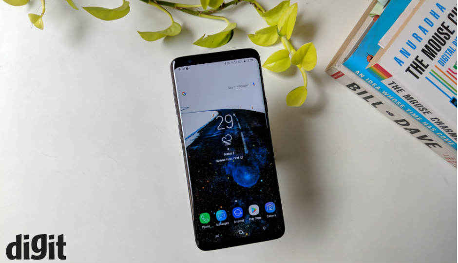
The Samsung Galaxy S9+ is the best Android smartphone available right. It's looks stunning especially because of the astoundingly bright display and a design that blends the display to the rest of the body. But more than that, this time, Samsung has taken a new approach to improving the low-light performance of the camera. The rear camera can switch between two apertures. The camera, if one knows how to take good photos, can produce some high-quality shots under poor lighting, especially in a restaurant on indoors, but there are limitations. Samsung's aggressive noise reduction alogrithms keeps the image from being perfect, but it's a commendable effort nonetheless. You can't go wrong with the S9+. It has everything you want from a top-of-the-line flagship phone — Latest high-level hardware, excellent design, high security, and an excellent camera. Having said that, it isn't much different from its predecessor, the Galaxy S8+, which is now cheaper and hence, a more value-for-money proposition. The Galaxy S9+ is evidence that this is an iterative year for Samsung and if you have been holding out on buying a good Android flagship, this is the one to get right now.
PROS
- Dual Aperture camera
- Astoundingly bright display
- Superior build quality
CONS
- AR Emoji
- Cluttered UI
Samsung Galaxy S9 Plus: Detailed Review
As much as Samsung likes to mock Apple, the Cupertino giant’s philosophies are shaping up the Android landscape. No, I’m not talking about the notch. That’s inevitable. I’m referring to the deeper philosophy that Steve Jobs swore by — Don’t fix what ain’t broken. In the fewest of words, that’s how you can describe the new Samsung Galaxy S9+. It can be interpreted as both good and bad. Samsung may not get extra points for introducing a new design with the S9+, but it did give the company enough leeway to work on the finer things, those that don’t always meet the eye, but do end up making a difference.
The Galaxy S9+ is evidence that this is going to be an iterative year for Samsung. As much as it would like to call the Galaxy S9+ a ‘reimagination’ of the smartphone, it’s more of a refinement with some inevitable upgrades.
There is of course the latest hardware inside. Depending on where you buy, the S9+ is powered by either Qualcomm’s latest chip or Samsung’s own 10nm chipset. There’s an Rs 8000 wedge between the Galaxy S9 and the larger Galaxy S9+ which is justified by not just a taller screen, but also more memory and a dual camera stack at the back.
But is worth the upgrade? More importantly, is it the best Android phone around right now? We find out.
Camera: From low light to more light
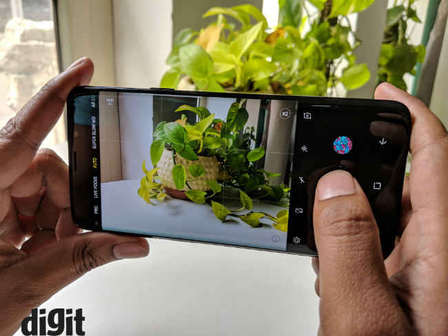
If last year’s Galaxy S8 was all about the Infinity Display, this year, the focus is on the camera. So that’s where the review should start, right? The problem that Samsung wanted to address with the Galaxy S9 and the S9+ is low light photography. The company has already set a benchmark for daylight imaging, and now it wants to redefine night photography. It’s an ambitious attempt, no doubt, but with its own shortcomings. We did a detailed camera analysis of the Galaxy S9+ which you can read to get more context.
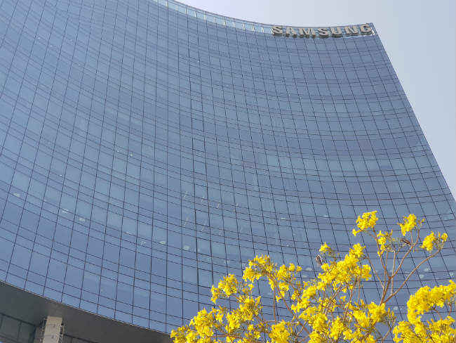
But before I dive further, allow me to lay down the specs at hand. The Galaxy S9+ sports a 12-megapixel wide angle-telephoto dual-camera stack at the back. It’s actually the same as that on the Galaxy Note 8. But with a small, but significant change. Variable aperture. Samsung borrowed the tech from its own super-expensive flip phone (the $2,000 W2018) that launched in China last year and introduced it to the world. The primary wide-angle 26mm is fitted with a dual aperture module that can shift the aperture from the usual F/2.4 aperture to a wider F/1.5 for low light shots. This is where the magic happens. The dual aperture feature is one of the primary reasons to buy this phone, if not the only one. We did a full-fledged camera analysis of the Galaxy S9+ if you are interested in the nitty-gritties.
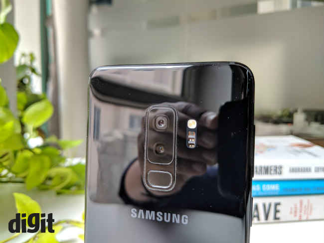
Aperture set to F/2.4 ( Notice the second sensor)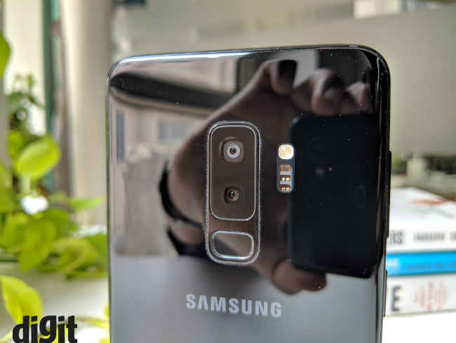
Aperture set to F/1.5 (notice the primary camera hole is wider here)
The wider aperture comes into play when there’s less light in the frame. Samsung automatically switches to F/1.5 when brightness falls below a certain point. You can also switch it manually from the Pro mode, along with the shutter speed, ISO, and the likes. Long story short, the F/1.5 aperture allows more light into the sensor and night shots are nicely lit up. It’s especially useful if you are in a dimly lit restaurant. The difference is quite discernible. But sometimes a bit too much. Most of the times the shots will come out surprisingly good. The details will be quite sharp and the frame will be perfectly lit. But sometimes, it becomes difficult to say whether the photo has been taken in a poorly-lit surrounding or a well-lit one. There’s a lot of light of coming in and the 1/2.55” sensor cannot possibly accommodate it all. That sometimes leads to the shots being overexposed. The wider aperture sometimes makes things too bright, while the F/2.4 aperture makes it too dark. Ideally, there should have been a third aperture setting, somewhere around F/1.7 to F/2.0, to bridge that big a jump, but I might just be asking too much. It’s commendable no doubt what Samsung has managed to achieve here. The Galaxy S9+ can easily light up poorly-lit frames better than anyone there, but the finishing touch is missing.

Exif: F/2.4, 1/33 sec shutter speed, ISO 200

Exif: F/1.5, 1/33 sec shutter speed, ISO 1600
If the hardware takes the future of smartphone low-light photography further, Samsung’s algorithms keep it from breaking new ground. The software behind the scenes aggressively reduce noise from the photo, sometimes smudging the details in order to make things look smooth. There’s the question of that yellow tint on night shots that have been there in Samsung phones since ages. There might be an audience for it, but it’s not my cup of tea. Add to that a layer of saturation and increased contrast, and you get a photo that might look good on the astoundingly bright AMOLED display, but to be honest, it just comes out as artificial. The iPhone X and the Pixel 2 keep things more realistic. The Pixel 2 can preserve the details even better while the iPhone X will take a better composed shot. Samsung has been taking a different approach to low-light photography and with the Galaxy S9+, it has reached new extremes. Both in a good way, and bad, depending on where you stand.

Exif: F/2.4, 1/6 sec shutter speed, ISO 100

Exif: F/1.5, 1/20 sec shutter speed, ISO 250
Nevertheless, this is indeed a big jump over how everyone else has been tackling the low-light barrier, and Samsung comes close to overcoming it.
Yet another highlight of the camera is the ability to record slow motion videos at 960 frames per seconds. That’s a big jump from the 240fps slo-mo the S8+ is capable of. It’s a fun tool to play around with. If you are actively trying to use the feature, you will suddenly be super aware of your surroundings, looking for mundane things to show in slo-mo. It needs a lot of light to work though. The feature is practically useless when there’s poor lighting. It also records the videos at 720p.
If you know how to leverage the Pro Mode, you can also use the F/1.5 aperture coupled with a suitable shutter speed to get a natural shallow depth of field in your macro shots in the day. Else, there’s of course the Live Focus mode that was there on the Galaxy Note 8. It works just like the Note 8. Well-detailed bokeh shots in the day and a dark noisy output at night.
The Galaxy S9+’s mojo revolves primarily around the camera. And for the most part, it remains a desirable proposition. But with the variable aperture, this one seems more geared towards professionals who have an idea of photography. In the hands of an amateur, the results might not be so satisfactory, but there’s tremendous potential in the camera, just waiting for you to use.
Performance: Fast, but not the fastest
As we have noted in a detailed performance analysis of the Galaxy S9+ before, the phone might be the fastest Android phone out there, but it’s definitely not the fastest phone. Our suite of benchmarking apps revealed the Galaxy S9+ falls way short of the iPhone X, which is currently the most powerful phone in the market. Despite the Exynos 9810 chipset which has been manufactured on a 10nm LPE process, powering the Galaxy S9+, it’s no match for the iPhone X’s A11 Bionic chipset.
Samsung has also used an underclocked version of the chipset. While the Exynos 9810 can reach a max clock speed of 2.9GHz, the Galaxy S9+ restricts it to 2.7Ghz. That’s probably to maintain uniformity with the Qualcomm Snapdragono 845 chipset which powers the device in some regions. The Snapdragon 845 can go up to 2.8Ghz.
Nevertheless, despite a no-show in benchmark results, the Galaxy S9+ which comes with 6GB of RAM and up to 256GB of storage is no slouch. It can handle just about anything you throw at it. Just not as efficiently as, say, the iPhone X, but that’s a whole different device. It’s right up there with the Pixel 2 and the OnePlus 5T which are among the fastest Android phones. Samsung also promised carrier aggregration for LTE networks including Reliance Jio and Airtel with maximum speeds up to 250Mbps, but in our real world tests, we got speeds only up to 8Mbps on Reliance Jio which is the standard 4G speed we get.
By looking at the Galaxy S9+, it’s clear that Android performance has hit a peak. There can be theoretical boost in performance, but in the real world you will hardly find a discernible difference from last year’s flagships.
Software: Needs more work
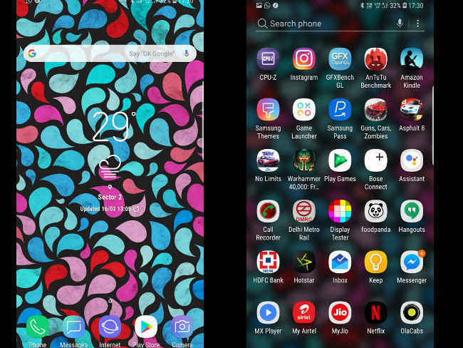
Samsung’s software has been the biggest pain point of using the flagship device. It’s just not as snappy as stock Android. That somewhat changed last year with the introduction of Samsung Experience, a more refined user interface that not only makes the device look more aesthetically pleasing, but also improves the performance.
Straight off, you will be locked down into Samsung’s ecosystem right when you first boot the device. Logging into your Samsung account will give you access to its cloud storage, keep your call list and texts backed up along with all your photos and videos. There’s also the Google route if you prefer that. There are dual instances of the Gallery app, Mail and the Browser as well as Samsung’s own app store.

The big change this time is the new AR Emoji, which as you can guess from the name, is a rival to Apple’s Animoji. It seemed a work in progress though. Samsung doesn’t use a 3D-mapping dot projector like the iPhone X. It also doesn’t provide enough diversity to accommodate every unique user. Also, they’re not the same as Animojis. Unlike Animoji that animates the regular emojis with your facial expressions, AR Emoji are essentially various expressions of your face. But the best part about them is that you can share them on any app, unlike Animojis that can only be shared via iMessage.
The curved edges of the screen also doubles up as a productivity hotspot. You can swipe from the edges to bring up favourite apps, contacts, and other options. There are way too many customisation options for me to include in this review, but the ones to note are the ability to dial down the display resolution, play around with the lockscreen texts and fonts as well as the home screen.
The Samsung Health app is an unsung hero though. It can reduce your dependence on a fitness band. The Health app can measure not only your heart beat, but also your Sp02 levels and using them, calculate your stress level. The accuracy may not be perfect, but it does the job for an average joe.
Since this is a phone centered around the camera, the camera app has received most of my scrutiny. To keep things short, it’s too cumbersome to use fluidly. The icons are too tiny and accidental touches ruin the experience. I accidentally switched to the front camera multiple times because of the swipe gesture while random touches around the edges kept switching the modes around without me asking for it.
Moving on, the UI is now more lightweight than ever, but it’s quite complicated for someone new to the ecosystem. The Settings Menu is not as intuitive as Stock Android and Samsung’s new ‘Intelligent scan’, which combines the iris scanner and the face recognition, is visibly slower than the competition. Although, it’s nice to see Samsung being confident enough to allow facial recognition to authenticate purchases and passwords.
Samsung’s security is now stronger than ever. The Samsung Pass app stores all your password and uses your biometric to authenticate them whenever you need it. Most features have been carried over from its predecessor including the Secure Folder, which allows a secure space to store files and apps. Samsung also combined its iris scanning and facial recognition into one feature called ‘smart scan’ which does work better than before, but isn’t as fast as the OnePlus 5T, nor is it as reliable as Apple’s FaceID. Smart Scan does not use 3D mapping to authenticate faces, it uses the front camera which makes it vulnerable somewhat. It’s even more concerning because Smart Scan can now be used to authenticate payments and passwords. However, the face unlock works even in complete darkness. It takes its time, yes, but uses the unbelievably bright screen to work it out. The fingerprint sensor, even though more ergonomically placed this time, is not the fastest one around. It took me a good 2 seconds to unlock the phone using my fingerprint.
Then there’s Bixby. It remains to be half-baked and very much forgettable. The annoying Bixby button makes things even worse as an accidental touch summons Bixby even when I was in the middle of playing a game or shooting a video. Very annoying. Bixby voice is not available right now and you can only converse with Bixby by long-pressing the dedicated button. Even then, you have to speak things very slowly as the AI-assistant has difficulty understanding Indian accents. It is beyond me why anybody would ditch the reliable Google Assistant for Bixby.
Display: Unbelievably bright
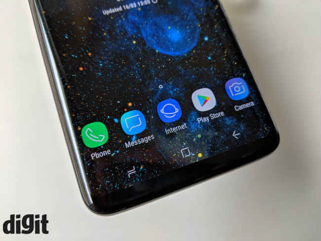
No matter how much Samsung wants to center the S9+ around its dual-aperture camera, the display is still the most prominent thing about this device. Samsung introduced the Infinity Display with the S8 and the S8+ last year and while the display on the S9+ looks mostly similar, Samsung has made some more advancements in making the panel look even better.
For the uninitiated, the panel on the S8+ is a quad HD Super AMOLED display of 6.2-inches with the edges curved to blend with the rest of the body. The display stretches from the top to the bottom with 18.5:1 aspect ratio and a pixel density of 529 ppi. It is Mobile HDR compatible and certified by the UHD Alliance.
DisplayMate, a leading display certification firm rated the panel on the S9+ it’s highest ever A+ grade, and for good reason. The display is visibly brighter than its predecessor and the colours are more accurate than ever. Like last year, the S9+ too has diamond pixels that packs the pixels closer to each other to achieve a higher density.
The auto brightness is extremely responsive and adjusts the luminescence of the panel perfectly with a change in ambient light. That way, the display, even though very bright, doesn’t strain the eye. There’s a night mode to boot as well.
The S9+ also goes a step further to offer four different display modes for photo, cinema and a basic. There’s another mode that switches between the three automatically based on the content called Adaptive Display. The adaptive display also changes the white point of the display based on the ambient light, similar to what iPhone’s TrueTone display does. You can also manually adjust the colour balance and even adjust the temperature of each colour individually. That’s a lot of tweaking, but if you are not literate in display calibration, it’s better to leave them untouched.
Design: Refined, not reimagined
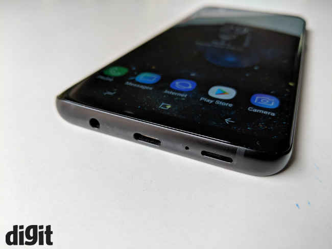
Place the S8+ and the S9+ side by side and you will not be able to tell the difference. Samsung kept the design of the phone unchanged from its predecessors, but there are progressive refinements in place. The S9+ continues to have the highly streamlined design where the display curves along the edges to blend in with the rest of the body. Also, the 3.5mm headphone jack survives! Samsung has shaved the bezels off the S9+ and the display now takes up even more real estate on the front.
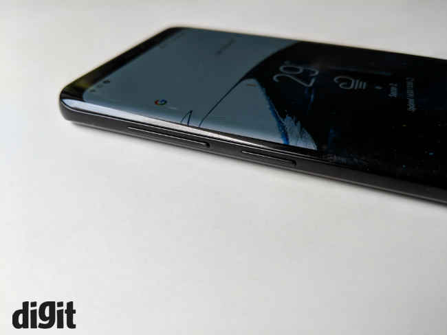
The S9+ is also bulkier than before. Samsung has used a sturdier grade of aluminium for the frame of the device that absorbs the shock better and prevent it from being passed to the display. As a result, the S9+ weighs a hefty 189 grams. It’s also thicker than before and slightly smaller than the S8+.
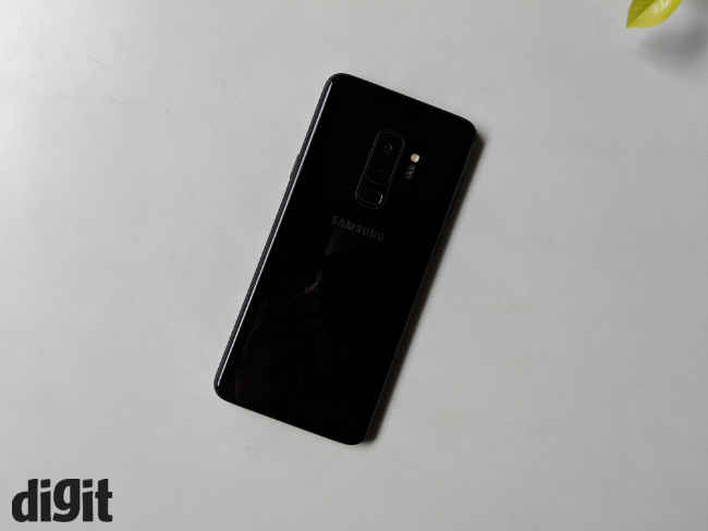
Turn the phone around and you will find more to discern the S9+ from the S8+. There’s a dual camera stack at the back, placed centrally at the back. Down below is the fingerprint sensor, which has been moved to the position to make it more accessible. Samsung seems to have heeded to user feedback and made the fingerprint sensor easier to access.
Having said that, between the S9 and the S9+, the S9 feels more compact and ergonomic. Thanks to its smaller size, the S9 is easier to operate with one hand while the S9+ feels unwieldy. The added heft means you have to hold the phone tighter and still have to move your hands up and down the phone to reach content on the top of the screen.
Battery: Humble capacity, yet reliable
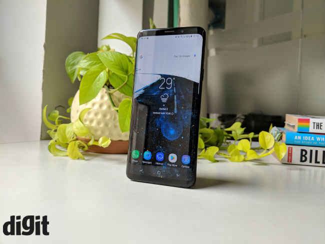
Yet another thing that remained unchanged in the S9+ is the battery capacity. Samsung is still taking no risk after the Galaxy Note 7 fiasco and powered the S9+ with the same 3,500mAh battery as the S8+. Thanks to the new chipset though, the 3,500mAh battery can last a little bit longer than its predecessor, but only slightly. The extra brightness negates the improvement in power efficiency. Still, you can easily squeeze a day and a half worth of juice out of the S9+, if you are using the phone as a daily driver.
PCMark’s battery test ran for 11 hours 25 minutes which is nearly the same as the S8+. In the real world, you can easily get around 13-14 hours of screen on time. It also charges quite fast, around 30 percent in 15 minutes which gives 6 hours of battery on normal use.
Bottomline
The Galaxy S9+ is the best Android phone in the market right now. It has a stunning display which remains unmatched, top of the line hardware and a camera that pushes the boundaries of mobile photography further than ever before. Yet, the best Android phone is the best by only a hairline. Last year’s flagships like the Google Pixel 2 and the OnePlus 5T come dangerously close to the S9+ in terms of imaging prowess and performance respectively. This can be taken as evidence that smartphones are close to hitting its peak. Nevertheless, the S9+ is more of a refinement than a ‘reimagination’ and if you already own the S8+, you can give this one a skip.
Other Popular Deals
 Samsung Galaxy S9, S9 Plus smartphones now up for sale via Flipkart, Samsung Shop and offline stores
Samsung’s flagship smartphones, the Galaxy S9 and the S9 Plus are now up for sale in India via Flipkart, Samsung Shop and the company’s...
16 - Mar - 2018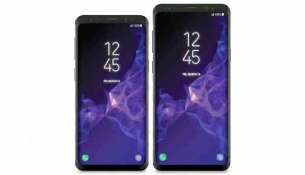 Samsung Galaxy S9, S9 Plus battery details leaked in images
Samsung is just weeks away from unveiling its flagship Galaxy S9 and S9 Plus smartphones at MWC 2018. Leaked images of the battery for model numbers...
02 - Feb - 2018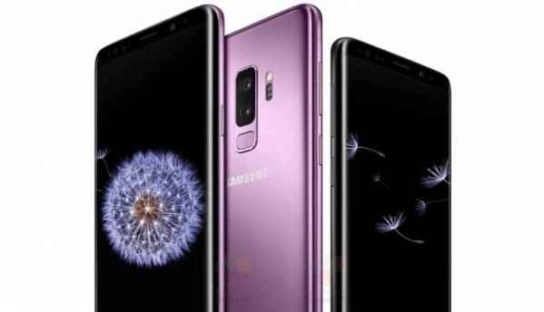 Samsung Galaxy S9 Plus with Snapdragon 845 SoC spotted on Geekbench, expected to cost above $999
The Mobile World Congress 2018 is just a week away and Samsung will showcase its flagship Galaxy S9 and S9 Plus smartphones a day before the event...
20 - Feb - 2018

As much as Samsung likes to mock Apple, the Cupertino giant's philosophies are shaping up the Android landscape. No, I'm not talking about the notch. That's inevitable. I'm ref...
---------------------------------------------------------------------------
Visit this link to stop these emails: http://zpr.io/PnAEp


Nice information..!!!
ReplyDeleteI found this information really helpful & also will share to the ones who's looking for the same.
Thanks